Others might ooh and ahh over Oscar nominations or watch a championship game with bated breath, but our favorite awards season will always be the Color of the Year picks. Paint creators and trend setters all over the world set out to encapsulate a whole 365 days in a single color, and we look forward to it every year.
Most of 2026’s picks leaned on the earthy, warm and rich (though Carlstadt-based Pantone went rebelliously minimalist). We’re loving every one of them—but what do designers think?
We asked four Garden State experts for their favorite, and some tips on how to use them.
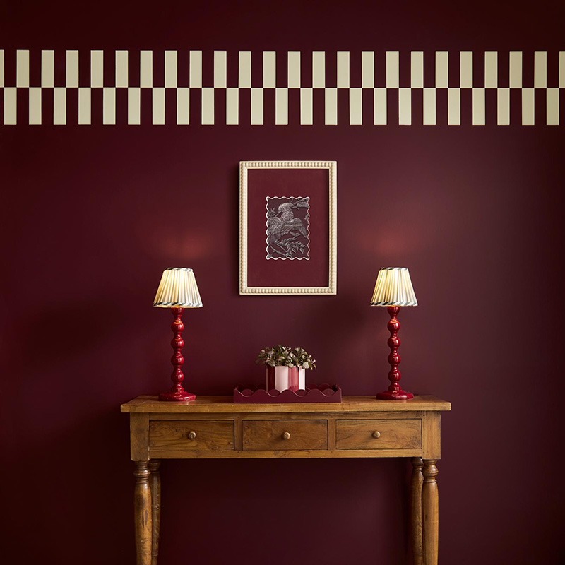
Warm and layered
“My favorite Color of the Year is Behr’s Hidden Gem, because it beautifully anchors a warm, layered color story,” says Andrea Leone of Manalapan’s I & I Designs. “It pairs effortlessly with tones like amethyst, spruce and marigold, creating a palette that feels rich and inviting without being overpowering.”
How to style it? She suggests, “Incorporate this through pillows, luxe velvet seating, artwork or even paint to add depth and personality. A color like Hidden Gem would be stunning in a library or woven into a dining room for an unexpected wow factor, especially when balanced with warm, creamy whites and accented with gold finishes for a polished, timeless look.”
Ethereal and soft
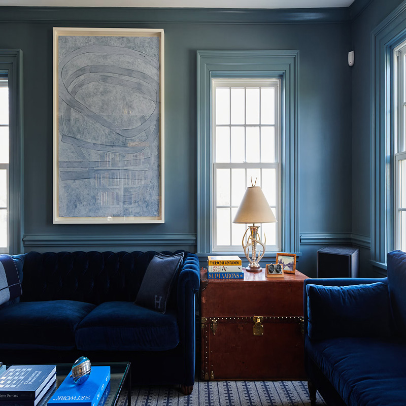
A different option? Oreoluwa Oderanti of Inspired Ore Home Décor in New Brunswick says, “Etsy’s Color of the Year, Patina Blue, is very exciting to me. It feels ethereal yet moody—soft enough to be calming but rich enough to create depth. I love using it in a bedroom, layered with warm wood tones to keep it grounded—try pairing it with another color of the year, Minwax’s Walnut, and both really shine!”
She suggests you use Patina Blue in “transitional spaces like hallways, where it can set the tone for the home. I’d elevate it by pairing it with warm wood accents and even subtle ceiling details, such as floral or decorative elements, to create a welcoming, personality-filled experience as you move from room to room.”
Bold and moody
According to Wyckoff-based Christie Adams, “Graham & Brown’s Divine Damson color has me the most excited because it is just such a bold and moody choice. I am finding more and more clients wanting to take a chance on a dramatic color, especially in a powder room or dining room, and this one would be stunning and rich. I would pair it with brass accents and a funky mirror in a powder room.”
Adams suggests, “For anyone looking to avoid trends, this color is a very timeless option.”
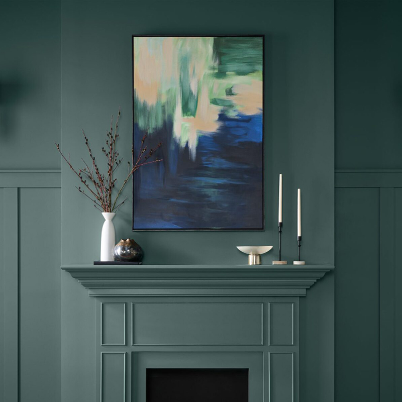
Calm and easy
“I gravitate to Valspar’s Color of the Year, Warm Eucalyptus,” says Denise C. Pough of A-Jay Interiors by Dee in Paramus. “This hue balances a natural green base with subtle warm undertones, creating an immediate sense of calm and ease. There’s a softness to the color that gently elevates neutral spaces without overpowering them. Warm Eucalyptus feels quiet yet sophisticated—offering a hint of vintage sensibility that translates beautifully into modern interiors.”
The hue also has plenty of versatility. “On cabinetry in kitchens, bathrooms or laundry rooms, it pairs effortlessly with warm wood tones in flooring or furnishings, with warm white tones and gold accents to complement,” Pough says. Where to put in on the walls? “It’s ideal for spaces dedicated to rest, reflection, and creativity—bedrooms, spa-inspired bathrooms, three-season porches or reading nooks—where a serene yet intentional atmosphere is key.”
What’s your favorite 2026 Color of the Year? Tell us all about it on Instagram @njhomemag!