Photos by Vic Wahby
How long has it been since someone asked your favorite color? It’s a regular playground icebreaker, but it’s also something you should think about now—especially if designing a space is in your future.
Maybe you’re thinking about a very bright blue, like the sky of a perfect beach day. Maybe it’s blazing cherry red, like fruit in the middle of summer. Perhaps you’re thinking about the golden orange of a sunset, the spring green of a new garden or the shade of purple that was in your wedding bouquet. You’re smiling now, aren’t you?
Colors make us happy. Whether you’re basing this conclusion on color psychology or your own experiences, it’s true that certain shades bring back memories and boost mood. Despite this, many of us shy away from incorporating hues when it comes to home décor. Conventional wisdom suggests that neutral colors are the safer choice when decorating a space, and that using bright colors, even if they’re your favorite, can quickly become loud and dated.
Conventional wisdom, however, doesn’t always apply. Pamela Cooper of Cooper Interiors in Watchung designed this Far Hills home in an English cottage style, and colors are the stars of the show. Homeowner Gina Lyons brought up her love of bright colors and bold patterns to Cooper, who was thrilled. Most of her clients ask for grays and whites.
“This was so much fun to do,” Cooper says of the project.
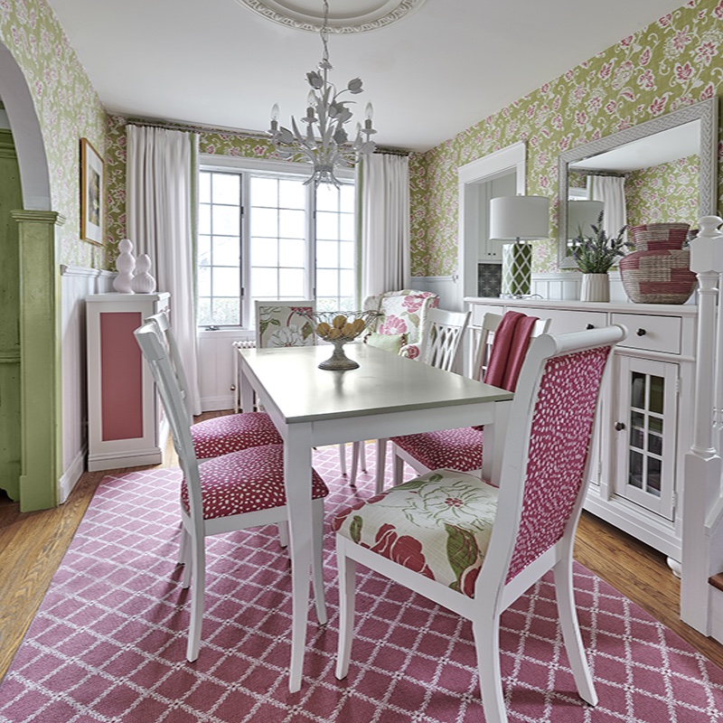
And fun, indeed, is the vibe the whole house gives off. For example, the dining area is a vision in berry pinks. Hydrangea wallpaper from Schumacher coordinates with the custom, pink-upholstered dining chairs, and the color is repeated once again in the raspberry and white carpet. People, it seems, can’t help but smile when they enter the room.
“It’s such a happy space,” Cooper says.

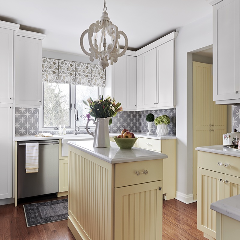
What a wonderful thing for a space to be. The kitchen does something similar, with its buttery yellow beadboard cabinets and white Shaker-style upper cabinets bringing to mind English cottage charm and warm spring days. Lyons is a dedicated baker who spends much of her time in the kitchen; she calls it “functional and beautiful.”

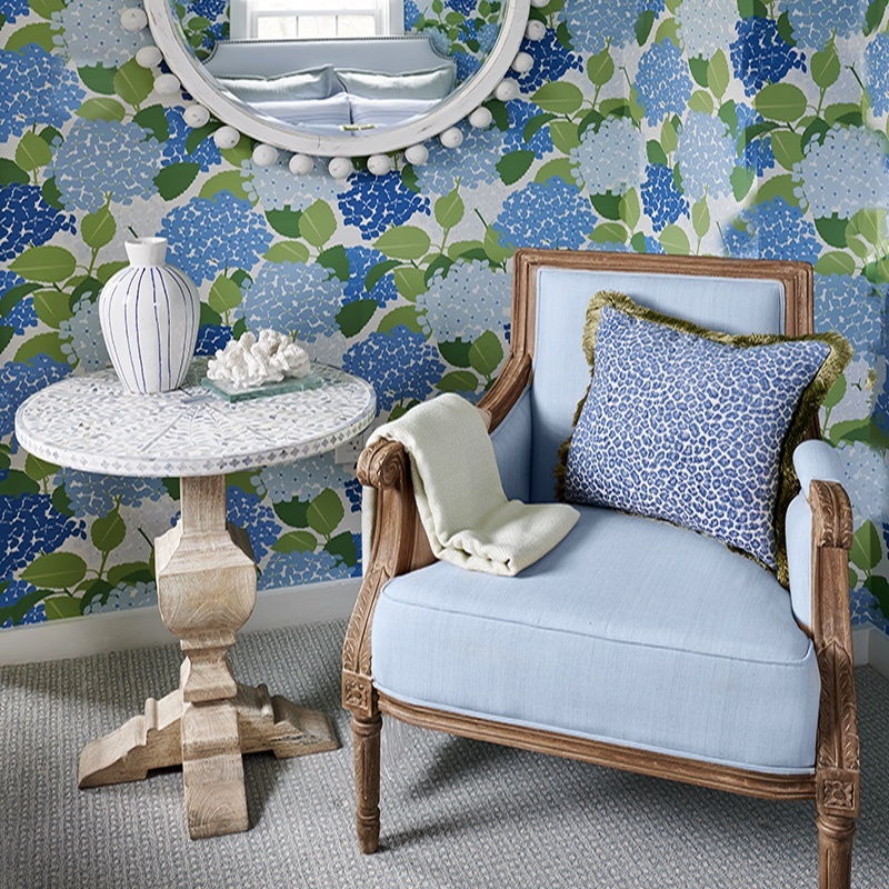
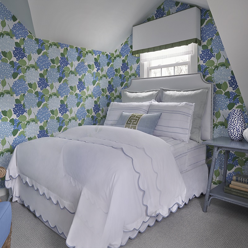
Worried about balance? Cooper has a simple solution, which she implemented in the bright blue guest bedroom. “Because the wallpaper is so bold, everything else needed to be quiet,” she says, speaking of the more muted white bedspread with blue scalloped trim. Rather than clashing and overpowering each other, the shades of blue and white all work together to make the room something cool and timeless.

So, before you start your next design project, think about our first question again—what’s your favorite color?
How do you feel about boldly colorful designs? Let us know on Instagram @njhomemag.