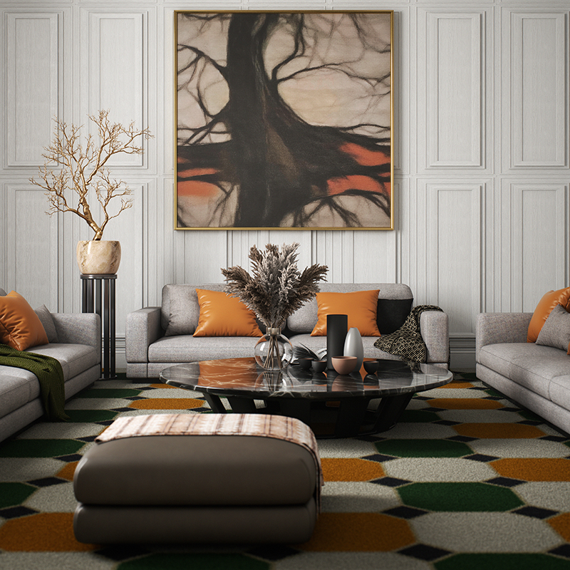
There’s something about fall that makes us want to rethink our surroundings. Maybe it’s the cooler air, the earlier sunsets or simply the irresistible urge to make home feel a little cozier. Whatever the reason, autumn is an especially good time to look around, take stock and ask: What’s next for my space? Fortunately, the design world has plenty of answers.
This season, interiors are moving toward warmth, personality and a sense of history—and Milan Design Week offered plenty of evidence that the shift is here to stay. Vintage and historical references are being thoughtfully mixed with contemporary pieces rather than recreated wholesale, creating rooms that feel collected and personal. That spirit was especially apparent in Milan, where reissued classics, patina, craftsmanship and historically inspired forms shared the spotlight with more experimental designs.
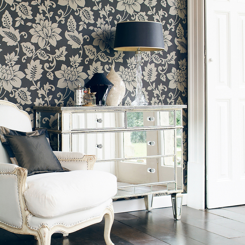
Even the idea of pattern is getting bolder: Pattern drenching takes wallpaper and other motifs beyond a single accent wall, enveloping rooms—even ceilings—in an immersive layer of color and texture.
Meanwhile, rich shades of burgundy, plum, chocolate, mustard and oxblood are bringing depth and drama to interiors. The takeaway? Today’s most compelling rooms aren’t necessarily the most pristine ones—they’re the ones with character, contrast and a story to tell.
And the color conversation is already looking ahead to 2027. While we wait for international color authority Pantone to weigh in, the first Colors of the Year from major paint brands suggest that next year will be all about interiors that feel grounded, restorative and deeply livable.
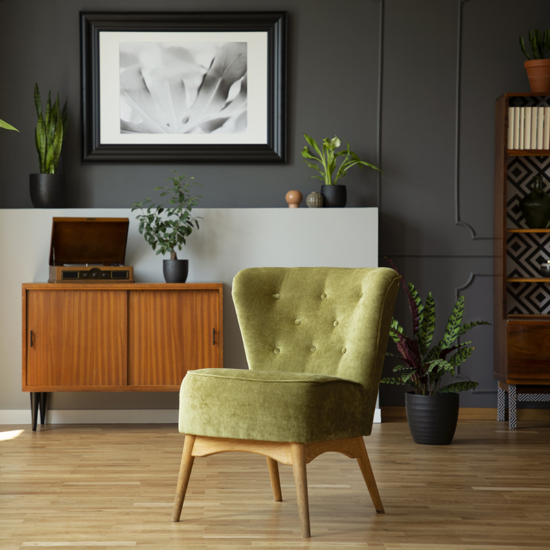
Behr’s Grounded, a nuanced olive green with mossy character and brown undertones, brings the outdoors in with a calming, earthy sensibility. Dutch Boy Paints’ Deep Rooted, a sun-baked orange somewhere between terracotta and clay, offers a warmer, more optimistic take on nature-inspired color.
Meanwhile, Rose Earth, Graham & Brown’s selection, combines dusty pink and terracotta for a sophisticated dose of personality, while Valspar’s Cottage Door, a powdery blue with subtle gray undertones, offers a quiet alternative to traditional neutrals. Together, they point toward a palette that feels decidedly human: natural, comforting and anything but cold.
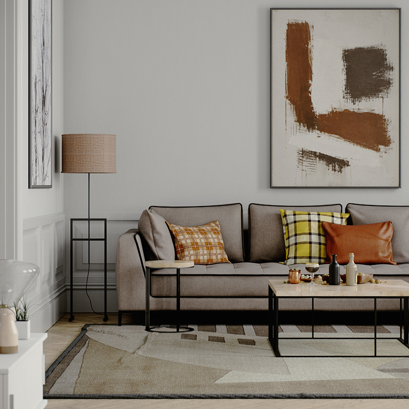
Of course, inspiration is even better when you can see it in person. Those in the trade will see the latest at next week’s High Point Market, but homeowners have other ways to see what’s new while meeting designers, decorators, artisans and home-improvement pros. Fall home shows are a great way to discover the idea that finally gets you to tackle that room. Upcoming events in and around our area include:
- Bucks & Montgomery County Home Show at the Newtown Sports Training Center in Newtown, Pa., Oct. 17–18
- Fall Westchester County Home Show at the Westchester County Center in White Plains, N.Y., Oct. 31–Nov. 1
- NJ Housing Expo Virtual Event, an online program, Nov. 27
So whether your fall design agenda involves a dramatic new wall color, a vintage find, a ceiling covered in pattern—or simply a little professional inspiration—consider this your invitation to look around. The season has arrived, and your home may be ready for a refresh.
For more tips, trends and things we love, be sure to read the latest issue of NJ HOME.